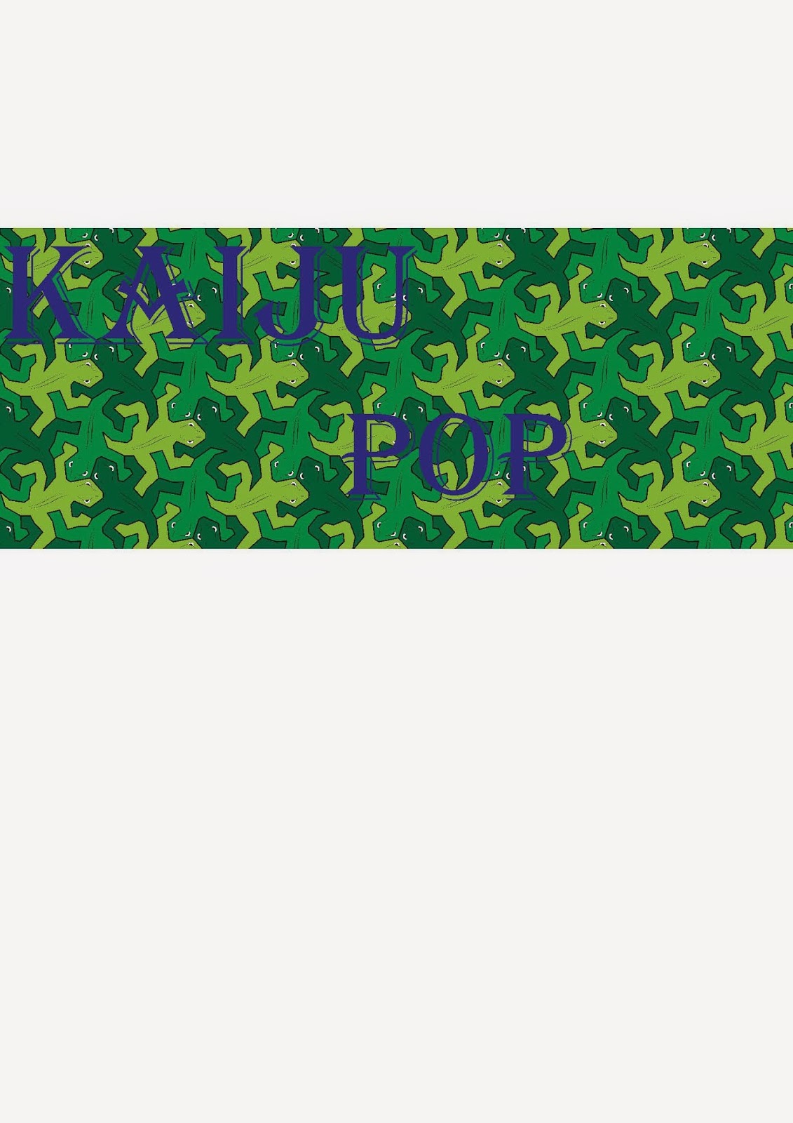
Development Log for Logo.
I am making a game on Game maker called kaiju pop, to make the game look more professional I had to make a poster for the game and now I had to make logo to represent the game as well. it had to be simple, definitive, easy to draw and most importantly had to represent my game well. First I sketched up a couple of quick ideas as can be seen below.
After developing these sketches I then decided to get some feedback from peers about what they thought about the ideas, which one was best, which ones could use improvement. I posted the picture on edmodo and got feedback this was one of them.
From this I gathered that the logo on the far corner is my best design but i wanted to develop more to relate it to my game more and more. So I went on 'Adobe Illustrator' to make the logo and came up with this design.
After making this logo I decided to see who like it, so I made a questionnaire to see who like it, the questionnaire showed me who my target audience are and more importantly who like the logo with the questions. this was the questionnaire that I developed.
From the questionnaire results I decided to make an infographic to look more into my target audience and to see who actually like the logo. This is the infographic that I created using 'Adobe Photoshop'.
From this infographic I gathered so much interesting information such as, nearly half of the people who took the questionnaire turned out to be female which I found interesting but studies suggest that 45 % of gamers are female. Another interesting thing I gathered through the infographic is that most of the people who took the survey are in the age range of 16-20 which was equally interesting as studies equally show that gamers 32% of gamers are ranged from 16-20. and lastly i gathered from my infographic that more people who are what I would consider as part of my targeted audience thought the logo was good. so with ease I decided to make this my logo.
Development log for marquee
As well as making a logo for my game I had to make a marquee for my game as well. at first I designed a couple and got feedback from my peers to see what one they liked and suggested improvements.
This is the first marquee I designed and I got some feedback of two peers:
Tom: I like the swatch inside the text, its easy to read but I don't like the background as its too basic and the pink outline doesn't look good either.
Dan: the swatch is a good feature I equally like the background but the pink outline doesn't work well.
Marquee 2
Tom: I really like this one because the swatche is similar to your logo, the only negative is that the font is a little difficult to read.
Dan : I really like this one but I don't see how it relates to your game.
Marquee 3
Tom: I like this one the least because the font is hard to read and the swatche behind the text is that good.
Dan: this is probably the least attractive one because the text is difficult to read and the pink outline doesn't look good as well.
Using feedback for improvement
After getting feedback from peers I decided to go with marquee 2 but to make improvements towards it from the feed back I received. I changed the swatche behind to something more colourful but kept it the same swatche design so that it looks similar to my logo and then I changed the font of the text and made it bold and black so that its easy to read this is the improved logo.
Final Marquee
Development log for Poster
As well as making a logo and marquee for my game I had to make a poster for my game equally. I made a poster and got feedback from two of my peers to see what they thought.
Original poster

Feedback
Tom: I really like this poster its very cool and relates to your game a lot, I cant really spot that many negatives but the only 2 things I would change is the texture of Godzilla to make it look smoother apart from that very good poster.
Dan: awesome poster, not many negatives minus the text is a bit hard to read maybe change the colour or font of the text apart from that awesome poster.
New poster
After the feedback I decide to take on the improvement so I changed the texture of Godzilla to make the image look smoother and more realistic than what it already was, also I change the colour of the text to plain white and repositioned it to make it easier to read. 


